
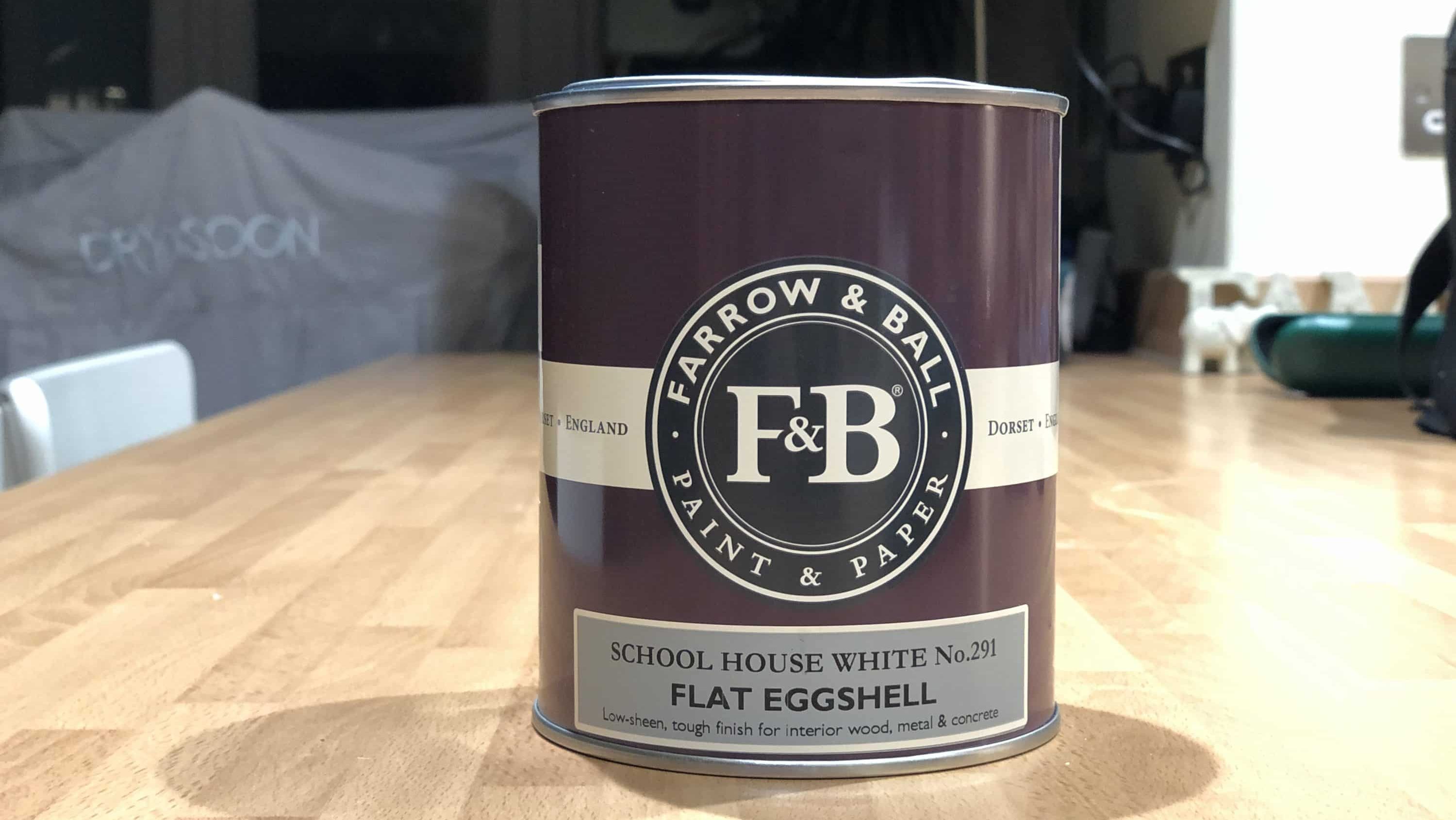


Ever since they first appeared in 1946, Farrow & Ball colours have been incredibly popular in UK homes, and some of their quirky colour names have become part of UK culture. But why are their paint colours so popular, and which ones in particular are loved by decorators, interior designers, and homeowners in 2026, eighty years after the company launched? (Still waiting for my invitation to the birthday party, by the way…)
Colour choice is of course vitally important in the design of any room, whether you’re an interior designer working in an 18th century manor house, a homeowner moving into a brand-new property, or a professional decorator like me, trying to help Mrs Johnson decide what colour to have in her spare bedroom. The choice of colour will help create the mood or “feel” of a room. But just as important as the colour is the choice of finish you use, if you want the paint to stay looking its best for as long as possible. So, if you’re reading this as you’re thinking about your next decorating project, we’d suggest reading it in collaboration with its sister blog, “Which Farrow & Ball Finish Is Best?”.
In this blog we’re going to look at some of Farrow & Ball’s enduringly popular shades. There isn’t room to look at every one of the 300+ colours, so we’ll focus on the most popular ones that are favourites with designers, decorators, magazine editors and homeowners alike. In each case we’ll describe the colour, talk about other shades that work well in conjunction with it, mention why homeowners and designers love it so much, and suggest which rooms it could work in. Although, this will also depend on other factors such as which way the room faces, the amount of natural light, any curtains, furniture, carpets etc in the room, and so on.
As mentioned above, it’s important to think about finish and durability as well as colour (especially in kitchens, bathrooms and high-traffic areas, for example), so please do have a read of our blog “Which Farrow & Ball Finish Is Best?”.

Why are Farrow & Ball Colours So Popular?
I’m sure the quirky colour names are part of it (although the phrase “I’m having Dead Salmon and Arsenic in my Kitchen” is never going to sound quite right to me!). Undoubtedly the brand itself is a big factor too, as with any designer brand; people love to be able to say, “I’ve got Farrow & Ball in my living room”. But those two things would never be enough on their own. The colours have to be something special too.
I’m not a paint technician, I’m a decorator, but when I’m working with Farrow & Ball paints, they seem to have a lot of pigment in compared to some other paints, which makes the colours very strong and rich. But they also seem to have lots of different pigments in, so that in different lights, or when placed next to different items of furniture, subtle changes seem to take place. For example, Ammonite 274 will look very different in a south-facing room (or with a “warm” yellow light bulb) compared to using it in a north-facing room (or with a “cold” blue-tinged light bulb). It’s both the amount of pigment, and the different pigments mixed together to give complex undertones to each shade, which makes Farrow & Ball colours so uniquely rich and versatile.
It’s also true to say that although Farrow & Ball have “only” been in business since 1946, many of their colours are inspired by paints, wallpapers or natural materials they have found while working in heritage properties, so some of these colours have actually been really popular for hundreds of years, and have been given a “new lese of life” by Farrow & Ball.
The Most Popular Farrow & Ball Colours
In this section we’re actually going to take a look at some of the most popular colours, discuss why they’re so popular, think about colours that can be paired together, and make suggestions on how and where they can be used; personal taste and preferences will always be a big factor, so these are just our thoughts; feel free to do your own thing. We’ll look at some ever-popular Farrow & Ball neutrals first and then look at some of their “statement” colours. Some of the latter are really strong shades, it’s up to you how you use them; you could just pick out a picture rail or fireplace to make a feature of it, do a “classic” feature wall, or colour drench the whole room, it’s up to you, and it also depends on the lighting, and the atmosphere you are trying to create. Apologies if your favourites aren’t included here!
Enduringly Popular Farrow & Ball Off-White and Neutral Shades
Colour |
Brief Description |
Ideal For |
| Wimborne White #239 | Off white | Where pure white is too cold/stark |
| Pointing #2003 | Warm off white | Works with warmer colours |
| Ammonite #274 | Pale “pure” grey | Creating calm, goes with anything |
| Skimming Stone #241 | Pale grey/greige | Adding warmth |
| Elephant’s Breath #229 | Darker greige | A modern classic |
Popular Farrow & Ball Off-White Shades
Number 239 – Wimborne White
- Description: the palest of Farrow & Ball’s off whites, Wimborne White has a drop of yellow in it to transform it into a warm, very pale cream.
- Where to use it: Number 239 is super-versatile, and can be used pretty much anywhere where you don’t want the cold “clinical” feel of a pure white. Ceilings, walls, woodwork can all be made to feel a little softer and more “homely” using this subtle shade.
- Complimentary colours: because it’s so subtle, it can go with almost anything, but it partners anything with yellow tones particularly well, like Dayroom Yellow, or natural shades like Hay or String.
- Why we love it: because it’s so versatile and will go with almost anything, and because it’s the perfect answer when clients ask me what to use when pure white looks too cold and clinical.
Number 2003 – Pointing
- Description: warmer than Wimborne White but still very pale, Pointing is named after the colour of lime pointing in traditional brickwork. I’d describe it as either a warm off-white or a very pale warm neutral.
- Where to use it: Pointing is also very versatile, but it’s brilliant for ceilings and woodwork in north-facing rooms to add warmth, or to partner with other warm shades. It looks amazing in cottage kitchens or on exteriors of older properties, where a pure white would be too cold.
- Complimentary colours: again, because it’s very subtle, it will go with almost anything, but it works especially well with Farrow & Ball’s other warm neutral shades like Dimity or Oxford Stone, for example.
- Why we love it: for similar reasons to Wimborne White – its versatility and its warmth, and also its ability to make rooms just feel cosy and homely.
Popular Farrow & Ball Neutral Shades
Number 274 – Ammonite
- Description: a soft, understated pale grey, Ammonite is more of a “pure” grey than Skimming Stone or Elephant’s Breath.
- Where to use it: Number 274, being quite a pure grey, is unlikely to clash with anything. Personally, I find it sometimes feels a bit cold in north-facing rooms, especially larger ones, but maybe that’s just me.
- Complimentary colours: I find Ammonite pairs particularly well with darker greys, and blue and green shades like De Nimes or Stiffkey Blue (see below).
- Why we love it: because it’s cool, it’s calm, it’s understated and it works really well with almost any colour.

Number 241 – Skimming Stone, and Number 229 – Elephant’s Breath
- Description: we’ve paired these two together, as they share similar attributes. They’re contemporary classics, the “godfathers of greige”; warm, homely neutrals that look grey in some lights and more beige-brown in others.
- Where to use it: Both these shades are great neutrals to use in rooms that you want to make cosy. Use them in north-facing rooms to make them less cold, or living rooms, bedrooms and snugs to envelop you in warmth without dominating the room.
- Complimentary colours: to keep the warm, contemporary feel going, partner these shades with Strong White (number 2001) rather than a pure white. Because they have a tiny hint of lilac in, these two will work surprisingly well with strong purple shades like Brinjal or Pelt, or warm browns like London Clay.
- Why we love it: because they’re classic warm, calming neutrals that work well in almost any space, whether contemporary or a period property.

Enduringly Popular Farrow & Ball Strong Colours
Colour |
Brief Description |
Ideal For |
| Stiffkey Blue #281 | Dark blue-grey | Statement walls or colour drenching |
| Railings #31 | Dark Blue-black | A softer alternative to black |
| Green Smoke #47 | Smokey blue-green | Calming, great in period properties |
| Rectory Red #217 | Rich red | Warm, welcoming spaces |
| Setting Plaster #231 | Dusky pink | Adding gentle warmth |
| Sulking Room Pink #295 | Darker dusky pink | Creating warm, comforting spaces |
Number 281 – Stiffkey Blue
- Description: a dark blue with grey tones, Farrow & Ball describe Stiffkey Blue as “inky”. It does change in different lights – in well-lit spaces the blue tones come through more, whereas in darker spaces it feels more darkgrey. In some lights it has a slight green tone to it as well.
- Where to use it: Feature walls, colour-drenching projects, kitchen cabinets – all look great in Stiffkey Blue. Personally I prefer it in well-lit rooms because I like the bluer tones, but that’s just my personal preference. Can look great in a bathroom to contrast white or pale grey tiles.
- Complimentary colours: Number 281 works well with Ammonite (see above) rather than warmer neutrals.
- Why we love it: bold without being overpowering, Stiffkey Blue exudes classiness, possibly because it’s not a “pure” blue, but has a lot of other things going on (grey and green undertones).

Number 31 – Railings
- Description: very dark blue, to the point where it is seen as a bluer alternative to black, or to the equally popular dark grey shade Downpipe (number 26).
- Where to use it: As the name suggests, it’s great for exterior metalwork, or statement front doors. It can of course be used indoors as well for a real touch of drama, but will look more blue in some lights, and black in others.
- Complimentary colours: pairing Railings with a pure white might create too strong a contrast, but using it with a shade like Blackened for example, which has a hint of blue-grey to it, would work much better.
- Why we love it: a great alternative if you don’t want to go for pure black, it looks perfectly at home on exterior metalwork but makes a dramatic statement when used indoors.
Number 47 – Green Smoke
- Description: well-named, this is a smoky dark green with plenty of blue in it
- Where to use it: This is one of the shades that has been around longer than Farrow & Ball as a company and was “borrowed” by them from 19th century properties. Naturally, it therefore looks amazing in period properties but also translates well to panelling in more modern homes, or even on internal/external woodwork or kitchen cabinets (using the correct finish, of course – Green Smoke in Flat Eggshell on kitchen cabinets could look fantastic!).
- Complimentary colours: you can pair Green Smoke with soft, cool neutrals like Cromarty or Mizzle; imagine the walls in Green Smoke and the ceiling and woodwork in Mizzle. Or flip it, and do the ceiling and walls in Mizzle, and highlight the woodwork in Green Smoke!
- Why we love it: it’s a very calm, serene colour which is unbeatable in period drawing rooms or on panelling.
Number 217 – Rectory Red
- Description: a rich, sophisticated dark red with a hint of pinkiness to it, named after historical church-owned properties.
- Where to use it: OK, I’m going to be honest now. Rectory Red doesn’t appear on any lists of Farrow & Ball’s most popular colours… except among my clients! I used it in one person’s home, and put photos on my website, and suddenly loads of people were requesting it! Yes, being another heritage-inspired colour, it naturally works well in older properties. But it can work really well in cosy spaces in modern homes, to create a warm, welcoming environment.
- Complimentary colours: use Rectory Red with warm, contemporary neutrals like Strong White or Skimming Stone
- Why we love it: it’s certainly a statement! Not everyone will love it, but it can look amazing, on both walls and furniture.












0 Comments